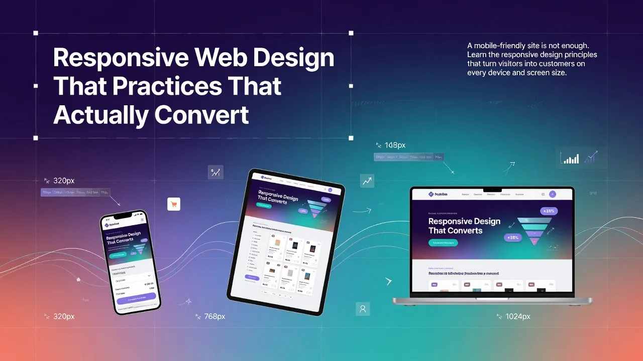
Responsive web design has been a best practice for over a decade. But most businesses still treat it as a checkbox — make the layout stack vertically on mobile, and call it done. That is not enough. True responsive design is about creating an experience that converts on every device, not just one that fits on every screen.
Mobile-First, Always
Design for the smallest screen first, then scale up. This forces you to prioritize content and functionality. If something is not essential on mobile, it is probably not essential at all.
Touch Targets and Spacing
Every interactive element — buttons, links, form fields — must be at least 44x44 pixels. This is not just a design preference; it is a WCAG accessibility requirement (SC 2.5.5). On mobile, fat fingers are real, and tiny tap targets destroy conversions.
Typography That Scales
Body text should be at least 16px on mobile. Headings need to scale proportionally. Line length should stay between 50-75 characters for readability. Never use fixed pixel font sizes for body copy — use relative units that adapt to the viewport.
Speed Is a Feature
- Compress and serve images in next-gen formats (WebP, AVIF)
- Lazy-load images below the fold
- Minimize CSS and JavaScript bundles
- Avoid custom fonts that are excessively large
- Use server-side rendering or static generation where possible
At Sunshine Inc, every website we build is mobile-first, accessible, and optimized for speed. Because a beautiful website that loads slowly on a phone is worse than no website at all.
Looking for a website that converts on every device? Explore our web design services